Provides Bootstrap 5 for Jenkins Plugins. Bootstrap is — according to their self-perception — the world’s most popular front-end component library to build responsive, mobile-first projects on the web. It is an open source toolkit for developing with HTML, CSS, and JS. Developers can quickly prototype their ideas or build entire apps with their Sass variables and mixins, responsive grid system, extensive prebuilt components, and powerful plugins.
This plugin bundles the latest release and corresponding Jenkins UI elements. Note that the Bootstrap release build has been adapted to integrate well with the existing Jenkins styles. For more details please see bootstrap-custom-build.scss. The build process uses npm to actually rebuild Bootstrap from sources and maven to bundle everything as a Jenkins plugin.
You can see the available breakpoints by including the following HTML snippet in your view:
<div class="row py-3">
    <div class="col-12">
        <span class="badge bg-secondary d-xxxl-inline d-none">xxxl</span>
        <span class="badge bg-secondary d-xxl-inline d-xxxl-none d-none">xxl</span>
        <span class="badge bg-secondary d-xl-inline d-xxl-none d-none">xl</span>
        <span class="badge bg-secondary d-lg-inline d-xl-none d-none">lg</span>
        <span class="badge bg-secondary d-md-inline d-lg-none d-none">md</span>
        <span class="badge bg-secondary d-sm-inline d-md-none d-none">sm</span>
        <span class="badge bg-secondary d-inline d-sm-none">xs</span>
    </div>
</div>
In order to use this JS library, add a maven dependency to your pom:
<dependency>
  <groupId>io.jenkins.plugins</groupId>
  <artifactId>bootstrap5-api</artifactId>
  <version>[latest version]</version>
</dependency>
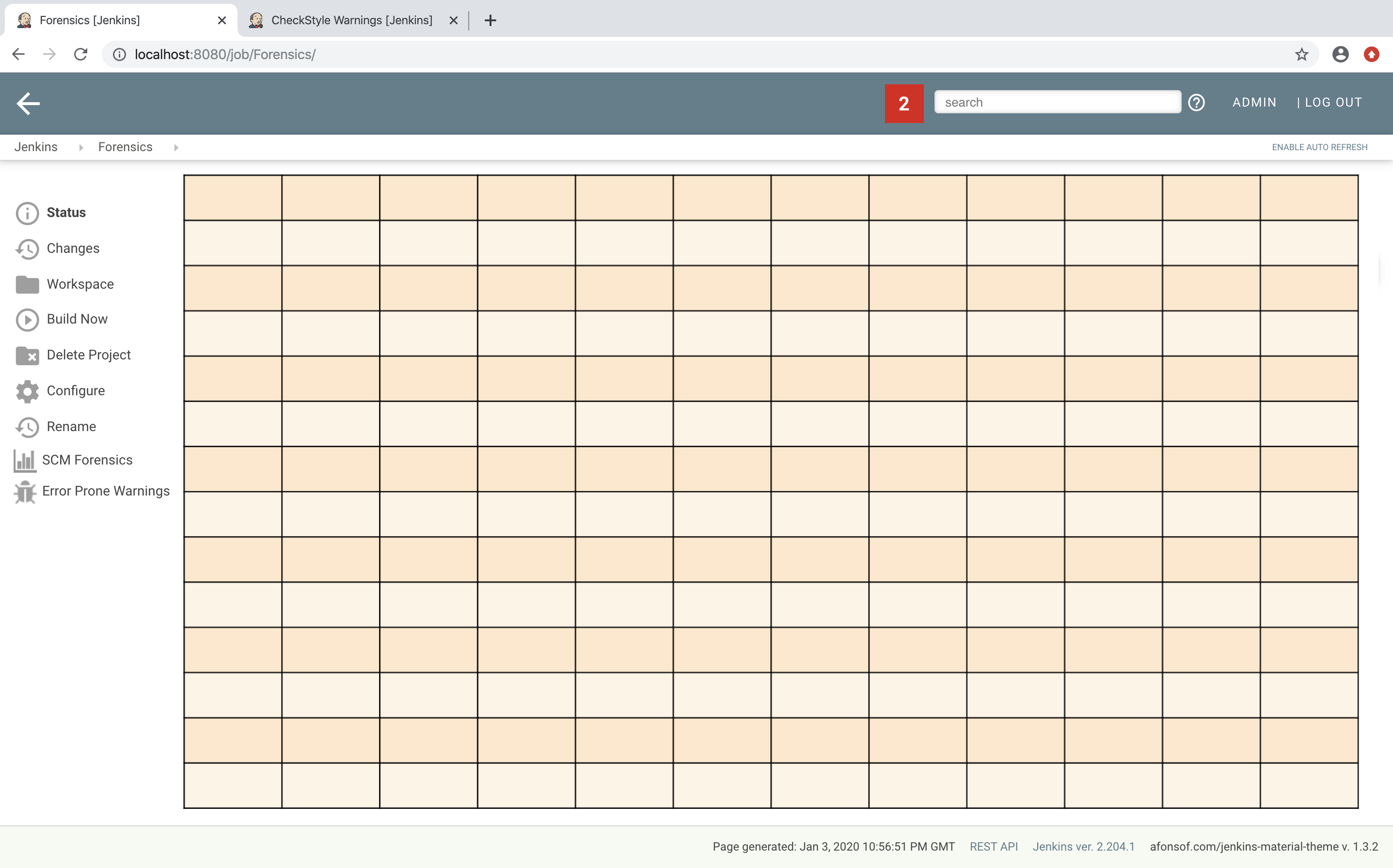
The first thing to decide is, which elements should be shown on a plugin page and how much space each element should occupy. Typically, all visible components are mapped on the available space using a simple grid. In a Jenkins view we have a fixed header and footer and a navigation bar on the left (20 percent of the horizontal space). The rest of a screen can be used by a details view. In order to simplify the distribution of elements in that remaining space we use Bootstrap’s grid system.
That means, a view is split into 12 columns and and arbitrary number of rows. This grid system is simple to use (but complex enough to also support fancy screen layouts) - I won’t go into details here, please refer to the Bootstrap documentation for details.
For the forensics detail view we use a simple grid of two rows and two columns. Since the number of columns always is 12 we need to create two "fat" columns that fill 6 of the standard columns. In order to create such a view in our plugin we need to create a view given as a jelly file and a corresponding Java view model object. A view with this layout is shown in the following snippet:
<?jelly escape-by-default='true'?>
<j:jelly xmlns:j="jelly:core" xmlns:st="jelly:stapler" xmlns:l="/lib/layout" >

  <l:layout title="${it.displayName}" norefresh="true" nogrid="true"> (1)
    <st:include it="${it.owner}" page="sidepanel.jelly"/>
    <l:main-panel>
      <st:adjunct includes="io.jenkins.plugins.bootstrap5"/> (2)
      <div class="fluid-container"> (3)

        <div class="row py-3"> (4)
          <div class="col-6"> (5)
            Content of column 1 in row 1
          </div>
          <div class="col-6"> (6)
            Content of column 2 in row 1
          </div>
        </div>

        <div class="row py-3"> (7)
          <div class="col"> (8)
            Content of row 2
          </div>
        </div>

      </div>
    </l:main-panel>
  </l:layout>
</j:jelly>
-
Enable the property
nogridso we can use the bootstrap built-in grid (and not the Jenkins grid). Otherwise the layout will break. -
Import Bootstrap 5: Importing of JS and CSS components is done using the adjunct concept, which is the preferred way of referencing static resources within Jenkins' Stapler Web framework.
-
The whole view will be placed into a fluid container that fills up the whole screen (100% width).
-
A new row of the view is specified with class
row. The additional classpy-3defines the padding to use for this row, see Bootstrap Spacing for more details. -
Since Bootstrap automatically splits up a row into 12 equal sized columns we define here that the first column should occupy 6 of these 12 columns. You can also leave off the detailed numbers, then Bootstrap will automatically distribute the content in the available space. Just be aware that this not what you want in most of the times.
-
The second column uses the remaining space, i.e. 6 of the 12 columns.
-
The second row uses the same layout as row 1.
-
There is only one column for row 1, it will fill the whole available space.
You can also specify different column layouts for one row, based on the actual visible size of the screen. This helps to improve the layout for larger screens. In the warnings plugin you will find an example: on small devices, there is one card visible that shows one pie chart in a carousel. If you are opening the same page on a larger device, then two of the pie charts are shown side by side and the carousel is hidden.
When presenting information of a plugin as a block, typically plain text elements are shown. This will normally result in some kind of boring web pages. In order to create a more appealing interface, it makes sense to present such information in a card, that has a border, a header, an icon, and so on. In order to create such a Bootstrap card a small jelly tag has been provided by the new Bootstrap plugin that simplifies this task for a plugin. Such a card can be easily created in a jelly view in the following way:
<bs:card title="${%Card Title}" fontAwesomeIcon="icon-name">
  Content of the card
</bs:card>
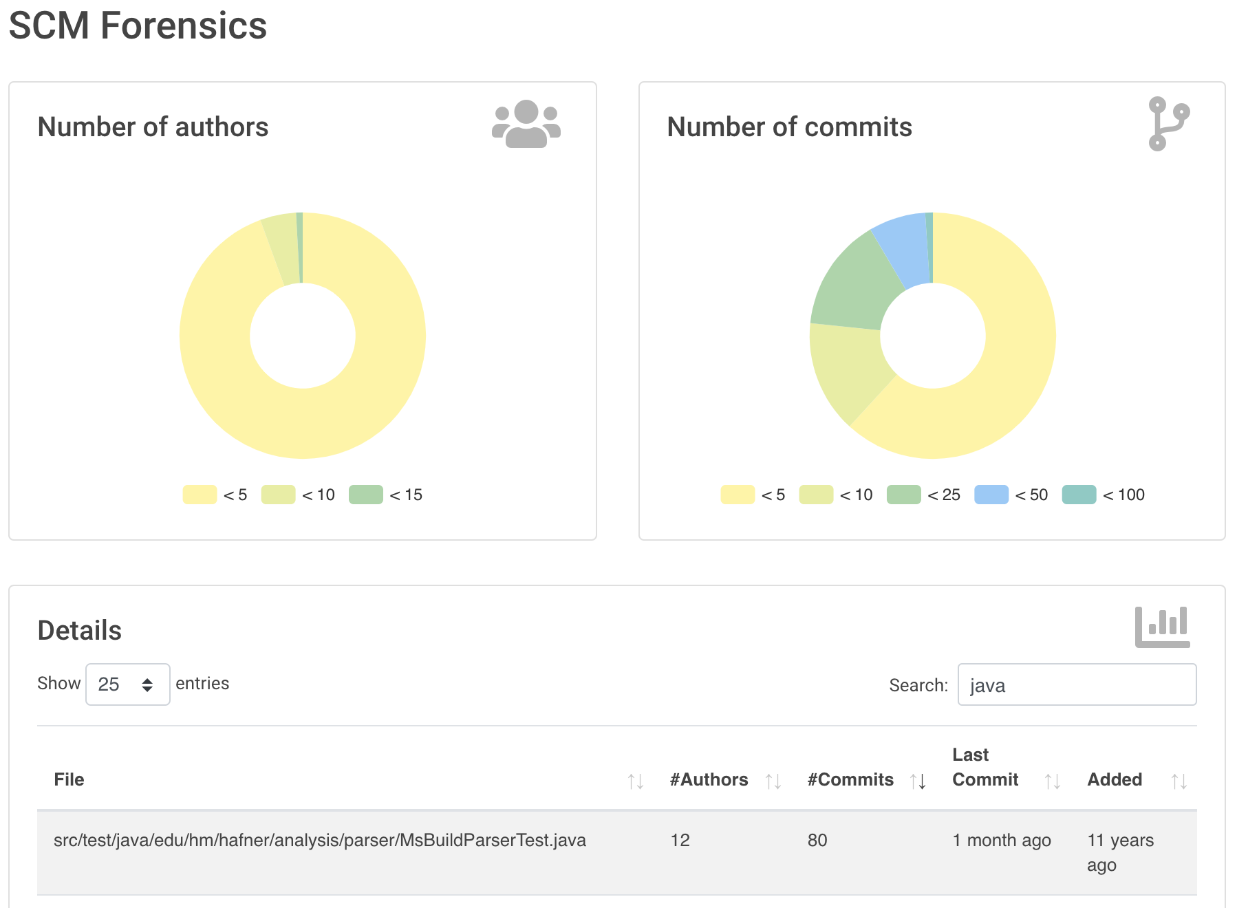
In Bootstraps cards in Jenkins plugins examples of such cards are shown. The cards in the upper row contain pie charts that show the distribution of the number of authors and commits in the whole repository. The card at the bottom shows the detail information in a DataTable. The visualization is not limited to charts or tables, you can show any kind of HTML content in there. You can show any icon of your plugin in these cards, but it is recommended to use one of the existing Font Awesome icons to get a consistent look and feel in Jenkins' plugin ecosystem.
Note that the size of the cards is determined by the grid configuration, see section Grid layout.
You can find several examples of Jenkins views that use jQuery in the Warnings Next Generation plugin and in the Forensics plugin.


