Provides ECharts for Jenkins Plugins. ECharts is an open-sourced JavaScript visualization tool to create intuitive, interactive, and highly-customizable charts. It can run fluently on PC and mobile devices and it is compatible with most modern Web Browsers.
This plugin contains the JS and CSS files of the latest ECharts release and corresponding Jenkins UI elements (model, view, and controller).
A Jenkins plugin typically also reports some kind of trend from build to build. Up to now Jenkins core provides only a quite limited concept of rendering such trends as trend charts. The JFreeChart framework offered by Jenkins core is a server side rendering engine that creates charts as static PNG images that will be included on the job and details pages. Nowadays, several powerful JS based charting libraries are available, that do the same job (well actually an even better job) on the client side. That has the advantage that these charts can be customized on each client without affecting the server performance. Moreover, you get a lot of additional features (like zooming, animation, etc.) for free. Additionally, these charting libraries not only support the typical build trend charts but also a lot of additional charts types that can be used to improve the user experience of a plugin. One of those charting libraries is ECharts. This library has a powerful API and supports literally every chart type one can image of. You can get some impressions of the features on the examples page of the library.
In order to use these charts one can embed charts that use this library by importing the corresponding JS files and by defining the chart in the corresponding Jelly file. While that already works quite well it will be still somewhat cumbersome to provide the corresponding model for these charts from Jenkins build results. So I I added a powerful Java API that helps to create the model for these charts on the Java side. This API provides the following features:
-
Create trend charts based on a collection of build results.
-
Separate the chart type from the aggregation in order to simplify unit testing of the chart model.
-
Toggle the type of the X-Axis between build number or build date (with automatic aggregation of results that have been recorded at the same day).
-
Automatic conversion of the Java model to the required JSON model for the JS side.
-
Support for pie and line charts (more to come soon).
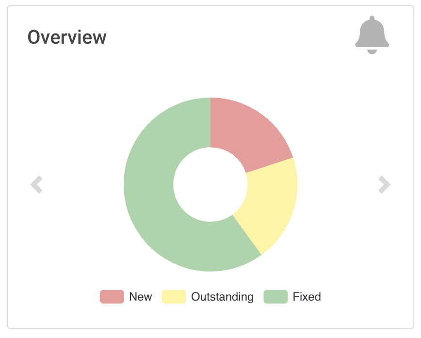
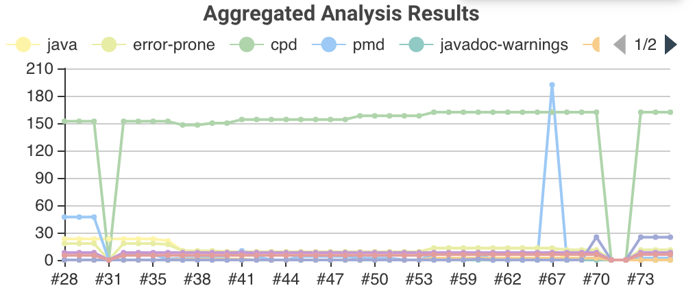
Those charts can be used as trend chart in the project page (see Trend chart with several lines in the Warnings plugin) or as information chart in the details view of a plugin (see Pie chart in the Warnings plugin).
A simple but still informative chart is a pie chart that illustrates numerical proportions of plugin data. In the Forensics plugin such a chart show the numerical proportions of the number of authors or commits for the source code files in the Git repository. In the warnings plugin such a chart shows the numerical proportions of the new, outstanding, or fixed warnings, see Pie chart in the Warnings plugin.
In order to include such a chart in your details view, you can use the provided pie-chart tag. In the following snippet you see this tag in action (embedded in a Bootstrap card):
<?jelly escape-by-default='true'?>
<j:jelly xmlns:j="jelly:core"  xmlns:c="/charts" xmlns:bs="/bootstrap">

    [...]
    <bs:card title="${%Number of authors}" fontAwesomeIcon="users">
      <c:pie-chart id="authors" model="${it.authorsModel}" height="256" />
    </bs:card>
    [...]

</j:jelly>
You need to provide a unique ID for this chart and the corresponding model value. The model must be the JSON representation of a corresponding PieChartModel instance. Such a model can be created with a couple of lines:
[...]
PieChartModel model = new PieChartModel("Title");

model.add(new PieData("Segment 1 name", 10), Palette.RED);
model.add(new PieData("Segment 2 name", 15), Palette.GREEN);
model.add(new PieData("Segment 3 name", 20), Palette.YELLOW);

String json = new JacksonFacade().toJson(model);
[...]
Another simple chart (that is based on a pie chart) is the progress chart. Using this chart you can render a simple progress value using a pie chart as backend.
In order to include such a chart in your details view, you can use the provided progress-chart tag. In the following snippet you see this tag in action (embedded in a Bootstrap card):
<?jelly escape-by-default='true'?>
<j:jelly xmlns:j="jelly:core"  xmlns:c="/charts" xmlns:bs="/bootstrap">

    [...]
    <bs:card title="${%Autograding score}" fontAwesomeIcon="graduation-cap">
      <c:progress-chart id="total-progress" model="${it.getProgressModel(80)}" height="150"
                        value="80" tooltip="80% is very good"/>
    </bs:card>
    [...]

</j:jelly>
You need to provide a unique ID for this chart and the corresponding model value. The model must be the JSON representation of a corresponding PieChartModel instance. Such a model can be created with a couple of lines, see the class PercentagePieChart.
In order to show a trend that renders a line chart on the job page (see Trend chart with several lines in the Warnings plugin) you need to provide a so called floating box (stored in the file floatingBox.jelly of your job action (see Jenkins chart model design)). The content of this file is quite simple and contains just a trend-chart tag:
<?jelly escape-by-default='true'?>
<j:jelly xmlns:j="jelly:core" xmlns:c="/charts">

  <c:trend-chart it="${from}" title="${%SCM Files Count Trend}" enableLinks="true"/>

</j:jelly>
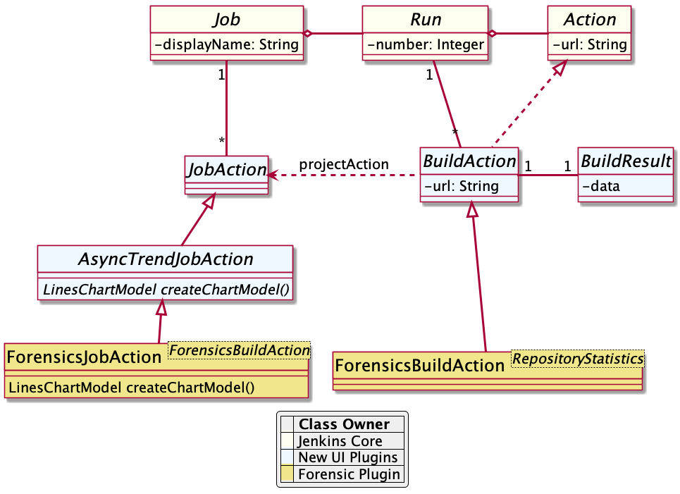
On the Java side the model for the chart needs to be provided in the corresponding sub class of JobAction (which is the owner of the floating box). Since the computation of trend charts is quite expensive on the server side as well (several builds need to be read from disk and the interesting data points need to be computed) this process has been put into a separate background job. Once the computation is done the result is shown via an Ajax call. In order to hide these details for plugin authors you should simply derive your JobAction class from the corresponding AsyncTrendJobAction class, that already contains the boilerplate code. So your static plugin object model will actually become a little bit more complex:
Basically, you need to implement the method LinesChartModel createChartModel() to create the line chart. This method is quite simple to implement, since most of the hard work is provided by the library. You will be invoked with an iterator of your build actions, starting with the latest build. The iterator advances from build to build until no more results are available (or the maximum number of builds to consider has been reached). The most important thing to implement in your plugin is the way how data points are computed for a given BuildAction. Here is an example of such a SeriesBuilder implementation in the Forensics Plugin:
package io.jenkins.plugins.forensics.miner;

import java.util.HashMap;
import java.util.Map;

import edu.hm.hafner.echarts.SeriesBuilder;

/**
 * Builds one x-axis point for the series of a line chart showing the number of files in the repository.
 *
 * @author Ullrich Hafner
 */
public class FilesCountSeriesBuilder extends SeriesBuilder<ForensicsBuildAction> {
    static final String TOTALS_KEY = "total";

    @Override
    protected Map<String, Integer> computeSeries(final ForensicsBuildAction current) {
        Map<String, Integer> series = new HashMap<>();
        series.put(TOTALS_KEY, current.getNumberOfFiles());
        return series;
    }
}
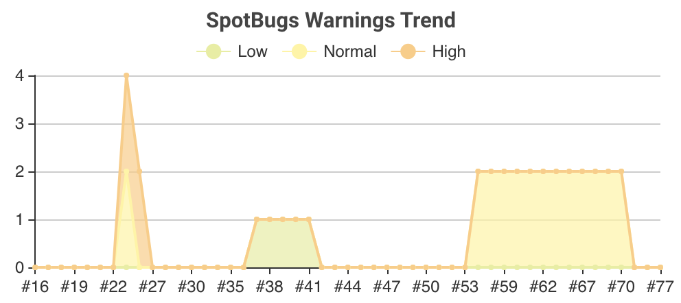
You are not limited to a single line chart. You can show several lines in a single chart, you can show stacked values, or even the delta between some values. You can also have a look at the charts of the warnings plugin to see some of these features in detail.
You can find several examples of Jenkins views that use ECharts in the Warnings Next Generation plugin and in the Forensics plugin.


